
The Ultimate Guide to Aspect Ratios in Modern Digital Design
In the rapidly evolving landscape of digital media, choosing the right image dimensions is no longer just a matter of aesthetics—it is a critical component of user experience and platform optimization. Whether you are a UI/UX designer, a digital marketer, or a content creator, understanding how to deploy the correct aspect ratio ensures your visual assets are displayed with uncompromising clarity. At LurkaWindo, we engineer our premium image collection to support diverse digital workflows.
1. The Standard: 16:9 (Widescreen)
The 16:9 aspect ratio is the undisputed king of horizontal displays. Originally developed for high-definition television, it is now the universal standard for desktop monitors, laptop screens, and YouTube video players. When selecting stock imagery for website hero banners, presentation slides, or cinematic video thumbnails, 16:9 provides a sprawling, immersive canvas that naturally guides the human eye from left to right.
2. The Mobile Revolution: 9:16 (Vertical)
With the explosive growth of mobile-first platforms like TikTok, Instagram Reels, and YouTube Shorts, the 9:16 aspect ratio has become essential. This vertical format is specifically tailored to fill the entirety of a smartphone screen without requiring the user to rotate their device. For modern creators, sourcing high-fidelity 9:16 imagery is crucial for capturing attention in fast-paced, swipe-driven social feeds.
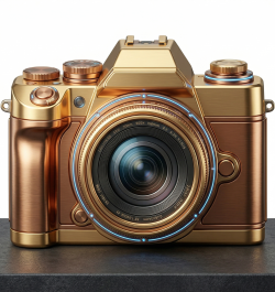
3. The Grid Anchor: 1:1 (Square)
The 1:1 square ratio is the foundational building block of social media grids, most notably Instagram and LinkedIn carousels. Its perfect symmetry creates a balanced, organized aesthetic that works beautifully on both mobile and desktop interfaces. Because it occupies maximum vertical space in a standard feed while remaining compact, the 1:1 ratio is highly effective for product photography, profile avatars, and text-overlay graphics.
4. The Classic Frame: 4:3 (Standard Photography)
Before widescreen dominated the market, 4:3 was the standard for computer monitors and traditional broadcast television. Today, it remains highly relevant in the world of traditional photography and print media. Many high-end digital cameras and medium-format lenses natively shoot in 4:3. It offers a tighter, more focused frame than 16:9, making it ideal for portraiture, editorial layouts, and gallery grids.
5. The Cinematic Canvas: 21:9 (Ultrawide)
For creators pushing the boundaries of immersive media, the 21:9 ultrawide ratio delivers a theatrical, panoramic experience. Originally used in anamorphic cinema, this ratio is increasingly popular among dual-monitor desktop users and high-end gaming setups. Using 21:9 imagery for ultra-wide website headers or dramatic landscape composites immediately signals premium, high-production value to your audience.
Choosing the Right Fit for Your Project
Selecting the correct aspect ratio is about respecting the platform and the viewer's device. Forcing a horizontal image into a vertical space leads to awkward cropping and lost detail. By deliberately sourcing assets engineered for exact proportions—whether it is a 1:1 social post or a 21:9 cinematic banner—you maintain total control over your creative vision. Explore our meticulously curated library to find the perfect dimensions for your next project.